Last Updated: 22/09/2023
Site Style and Credits
My site name and username in a few other places actually comes from one of those old Tumblr color palette memes, in which it was actually “subtle melancholy” and I had completely forgotten I had seen it until I went to google whether or not “subtlymelancholy” yielded many results. I wanted a phrase with “melancholy” in it because at the time I was invested in old proto psychology and medical theory, particularly humorism and the idea of the four temperaments.

Mine (surprise surprise) is melancholic or “cold and dry,” and I think it’s just fun to use such an old personality diagnosis to describe myself in the present day. Now it is more a descriptor, which means "a feeling of pensive sadness, typically with no obvious cause." It’s a very pretty word I find myself identifying with a lot, although I can never quite say it right. About a month after I started using it for my Ravelry, an Instagram page and a YouTube channel though, someone published what I believe is a poetry collection with the title “Subtle Melancholy” derived from that same color palette. Hopefully I’m not stepping on their toes.
Website Style
This site was created intially using sadgrl's website builder. I specifically used the older build of it, but both versions are available and fully-functional. Any unattributed graphics displayed without credits were pulled from GifCities, a tool used to search for old blinkies and other graphics from the Internet Archive's collection. The little flower cursor is hosted on cursors-4u.com by the user Amy.
The inspiration for the actual visual design of my site I’m sure is inspired by my formative online years spent on flash game sites, deviantART, Tumblr, YouTube, and various video game fan sites and wikis. Lots of text, captioned images, quirky navigation, table layouts, and those lovely lovely rounded corners. When I think of what the sites I actually do like using have, it’s consistent theming in the language used for navigation, centered written and visual content, and visually cohesive subpages and post layouts. I tried to do that here, even with my more themed shrines I've kept the same basic page structure.
My website is built partially in the Neocities code editor, Notepad++, and in codepen.io. I work with two monitors, one horizontal and one vertical, with the vertical monitor usually being used to code. I like using the separate editors and holding my code in an external document to create save points, and the responsive way codepen.io works in updating a preview of how your code will be read and displayed. This also keeps your activity in the Neocities feed from going apeshit, and nobody will see anything you’re not ready to publish yet.
For the written stuff, I kinda just write down anything that pops into my head in either the built-in Samsung notes app, Google Docs, or scribbling on the backs of scrap paper at work when I’m having a boring day on the cash registers. Similarly to why I like external code editors as opposed to live-editing and storing everything in the Neocities editor, I like to be able to really go back and refine my writing before publishing it. The scribbles also allow me to visualise my site in a way that just Thinking about html can’t. I use Clip Studio Paint (which I absolutely love) and MS Paint (or brushes to simulate MS Paint). I create both my illustrations and my pixel art in CSP.For photography, scans, and edits, I love using Paint.net. I use it on my desktop computer with a mouse, and it’s how I adjust all my photographs, cut out scanned sticker sheets, and make quick recolors of my bullet points and color swatches.
Font
I use the Merriweather font family, as I love how tall it is and how it still has a bit of a classic typewriter look to it. It is designed to be read on screens of all sizes, and I've seen it recommended for text-dense webpages. It's a free font that can be downloaded here from fontsquirrel. I have it set to 14.5pt by default for the main content of the website.
Color Palette
 text = #272824
 content background color = #F2ECE1
 content border color = #CFC0A4
 navigation bar and footer bar color = #A1AD94
 navigation bar and footer bar border color = #8A9A7A
 background site color = #677B5B
 site content contrast color = #FFD0E0
 site content contrast shading color = #FFB0C0
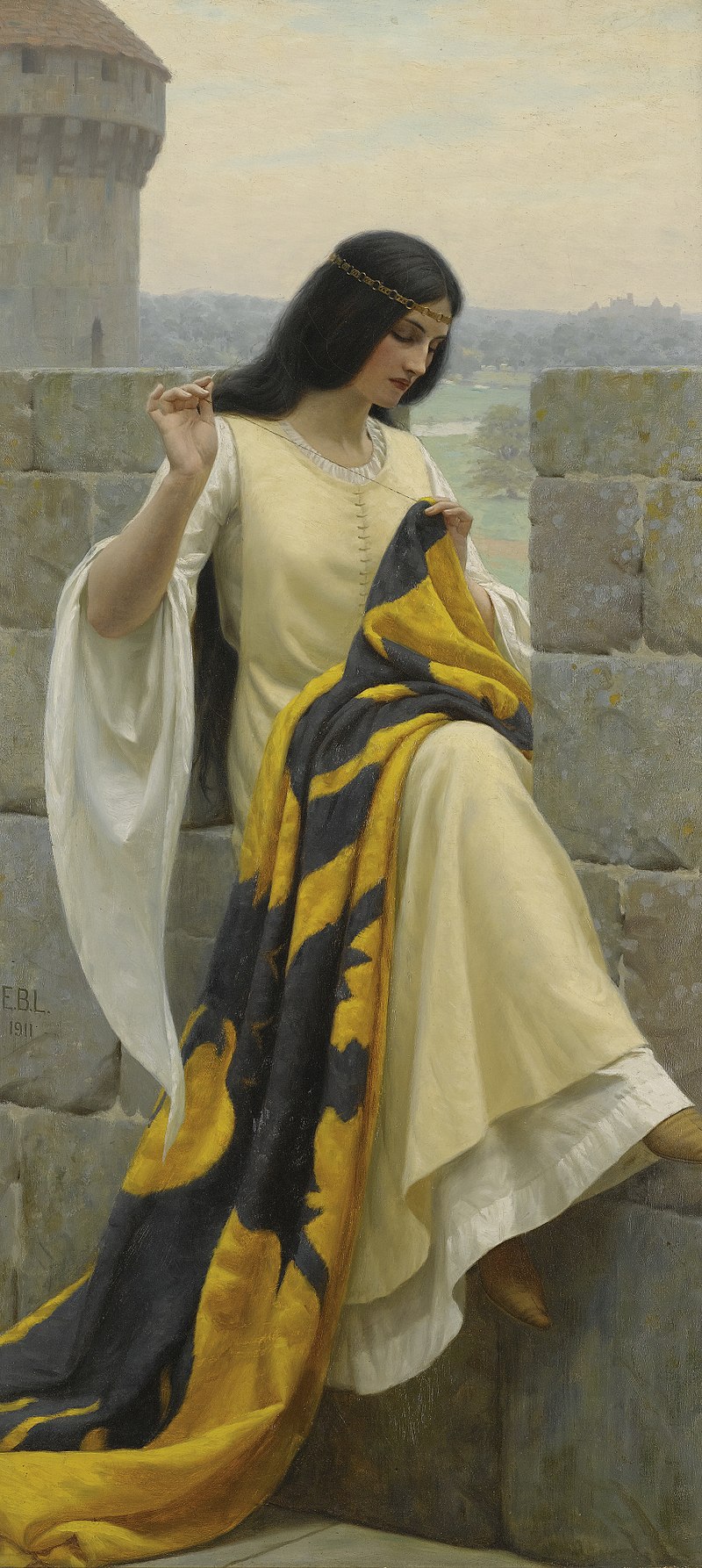
Fun fact! All of the greens, yellows, and blacks were picked from a digital image of the Edmund Leighton painting "Stitching the Standard", of a young woman with long dark hair sewing together a black and yellow flag while overlooking a castle garden. It is one of my favorite paintings. The two pinks were taken from the little rose divider from Bonnibel's collection I have on my left sidebar.
Other Helpful Sites (Graphics Collections + Coding Help)
As you can see I use a very Internet style of citation, and this is consistent across my pages, including my shrines. I try to give a description of where the link is going, and do my best to make sure that the links I've given are indeed still active and available.
Some of these outgoing links go to websites which have lots of high-contrast, eyestrain, and/or flashing graphics. Specific ones will be marked with this icon and "warning" as the alt text. ![]()
Amassment Organization - A shrine discussion community with tutorials, discussions, and even a forum all about building web shrines. It's not very active anymore, but it has a ton of fantastic examples and starting points for building your own.
![]() A.N. Luca's 88x31 Button Collection - A source for classic Web 1.0 buttons, including many of the ones in the "Netscape Now!" style.
A.N. Luca's 88x31 Button Collection - A source for classic Web 1.0 buttons, including many of the ones in the "Netscape Now!" style.
![]() Bonnibel's Graphic Collection - A varied collection of cutsey pixel art graphics collected by Bonnibel, the webmaster of Tangerine Tree.
Bonnibel's Graphic Collection - A varied collection of cutsey pixel art graphics collected by Bonnibel, the webmaster of Tangerine Tree.
Clipart Warehouse A tumblr blog in which the user shares individual clipart pieces from the CD-ROM of Clickart 50000, a classic clipart program designed for use on webpages and in personal digital projects. As far as the user knows the pieces are not in the public domain, however may be classified as "abandonware". They have also provided a link to the full contents of the Clickart CD-ROM as an upload on the Internet Archive.
CSS Cookbook — A tutorial website to help learn how to use CSS and how it will display on your website
![]() Enchanting Castle - A site where the user shares their collection of graphics and scans from around the web and from Japanese sales and auction sites.
Enchanting Castle - A site where the user shares their collection of graphics and scans from around the web and from Japanese sales and auction sites.
Codepen.io - Codepen.io is a site where you can see a live updating html and css webpage as you work on it. I've started using this instead of my base page to test out ideas and construction.
Fontawesome - FontAwesome is a web-based icon library with a variety of free and paid plans to give web designers a wide variety of icons to decorate pages and add a visual element to text-heavy sites.
![]() Graphics-Cafe on Tumblr - A blog where the user both creates and shares graphics from around the website. Check the individual posts for permissions for sharing and using on Neocities and similar web-building sites.
Graphics-Cafe on Tumblr - A blog where the user both creates and shares graphics from around the website. Check the individual posts for permissions for sharing and using on Neocities and similar web-building sites.
Lipsum.com" - A simple site that hosts the sample "Lorum Ipsum" text used in design as placeholder for written content.
HTML Color Codes — a simple website great for website and general design and color picking, offering hex code pickers and color palettes related to different shades.
HTML Colors from image - A great tool I use to color pick to get the hexcodes for colors I use, both for making this site as well as working on my digital art.
Moon Connection's Moon Phase Module — A great little widget that tracks and displays the current moon phases based on your location/timezone!
Pixabay - This is my favorite source for aesthetic photography. The pictures are all uploaded under various creative commons licences. If you really like someone's photography, you can also pay them via Ko-Fi.
publicdomainvectors.org - Another source for freely useable clipart and vector images.
Status Cafe — A widget you can link up to your website and display a current mood, alongside a little emoticon! I think it's fun.
Texture Ninja — A public domain source for repeating textures/patterns for use in graphic and web design.
Virtual Observer's Neocities Comment Box Widget — This is a really sleek, easily customizable comments box that is easy to set up (considering all the hard Javascript work is done for you!). It does require you to set up a Google Forms and a Google Sheets document to set it up, but the page has the complete tutorial with screenshots and instructions for each step of the way.
Wikimedia Commons - "Freely usable media files to which anyone can contribute" hosted and managed by the Wikimedia Foundation.
W3Schools - This is a great resource for almost any possible tutorial you could possibly need to learn how to create anything for your website.
Web Content Accessibility Guidelines 2.0-2.2 overview - A very basic introduction and overview of web accessibility standards, what to consider, and how to accomodate your web design to make it more accessibile to more different people.

